Roselle Public Library
Studio:
Simple Truth
Project:
Brand Expression
Category:
Brand Story
Identity
Roselle Public Library is a staple within the Roselle community. Providing access to resources, creativity, safety and support to those who walk through their doors. As the library prepared for the next phase in its story, they sought to create a new brand that reflects their unique and vital place in the Roselle neighborhood.
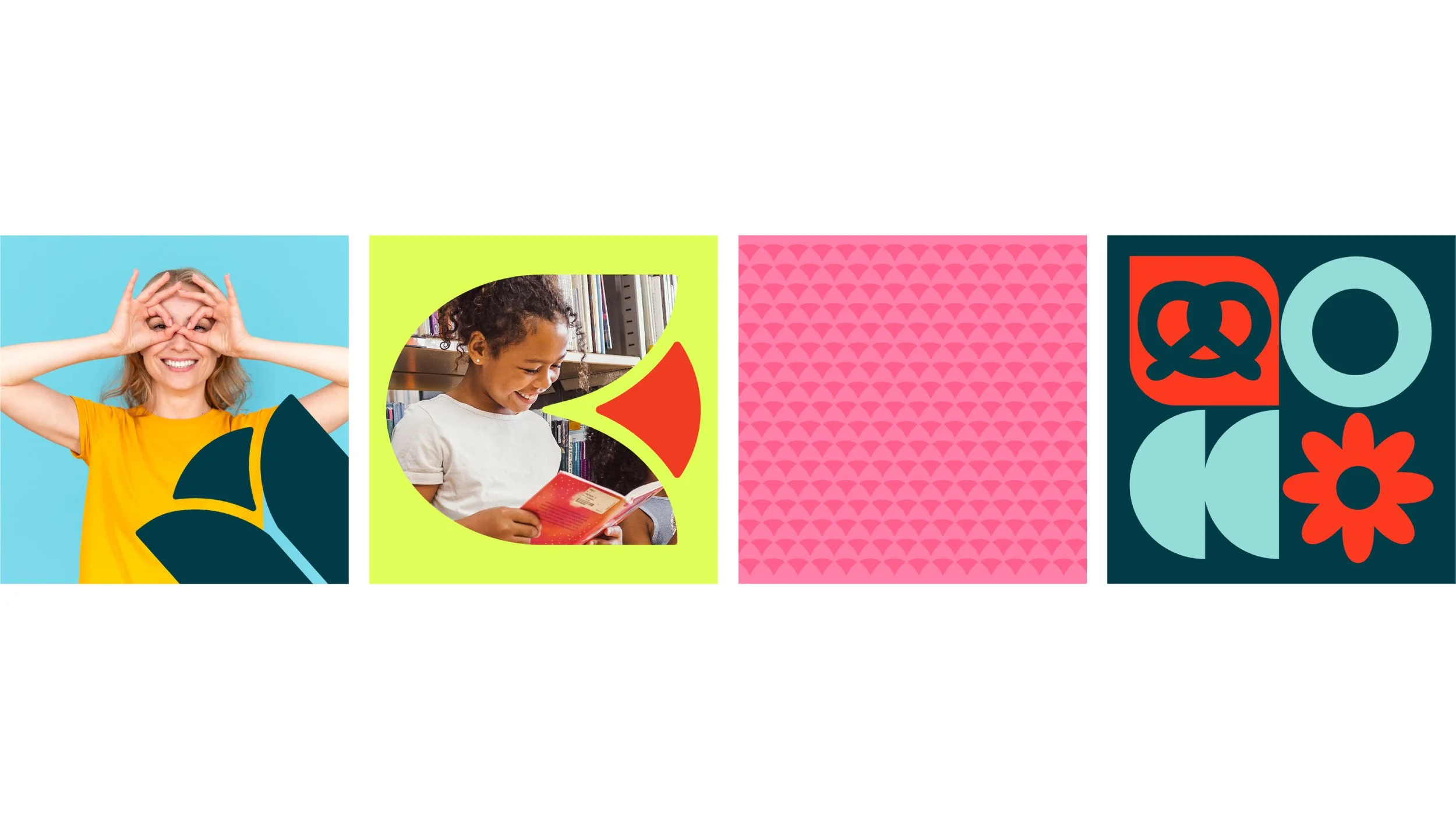
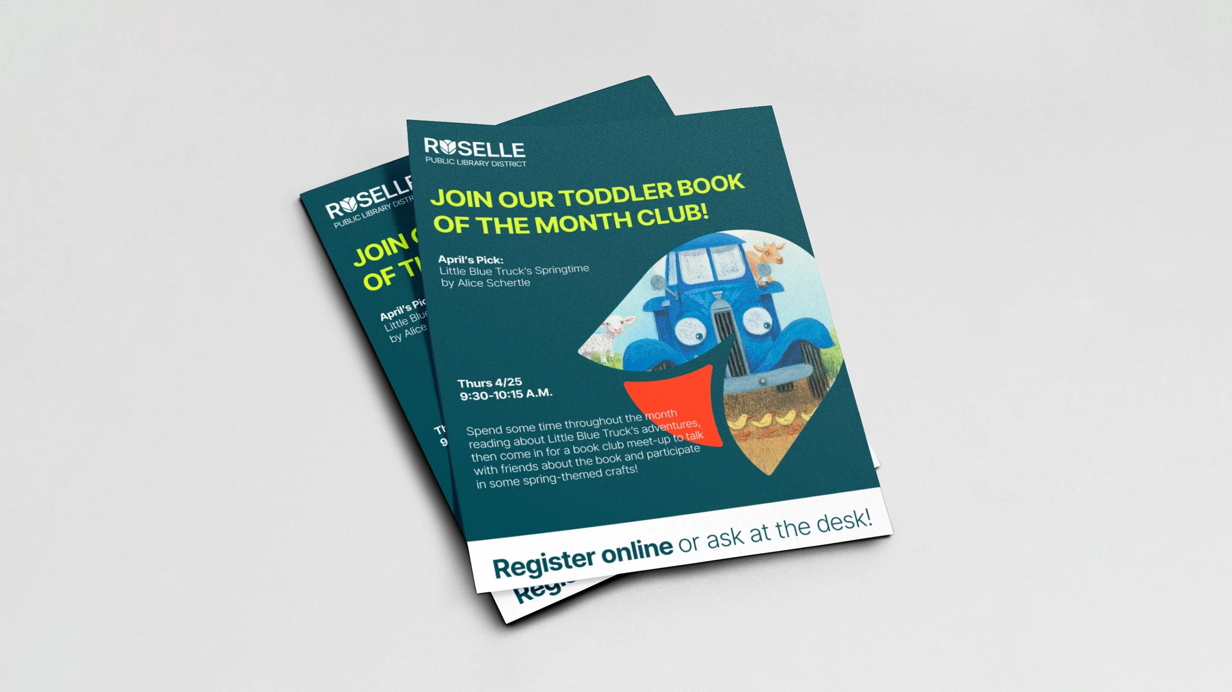
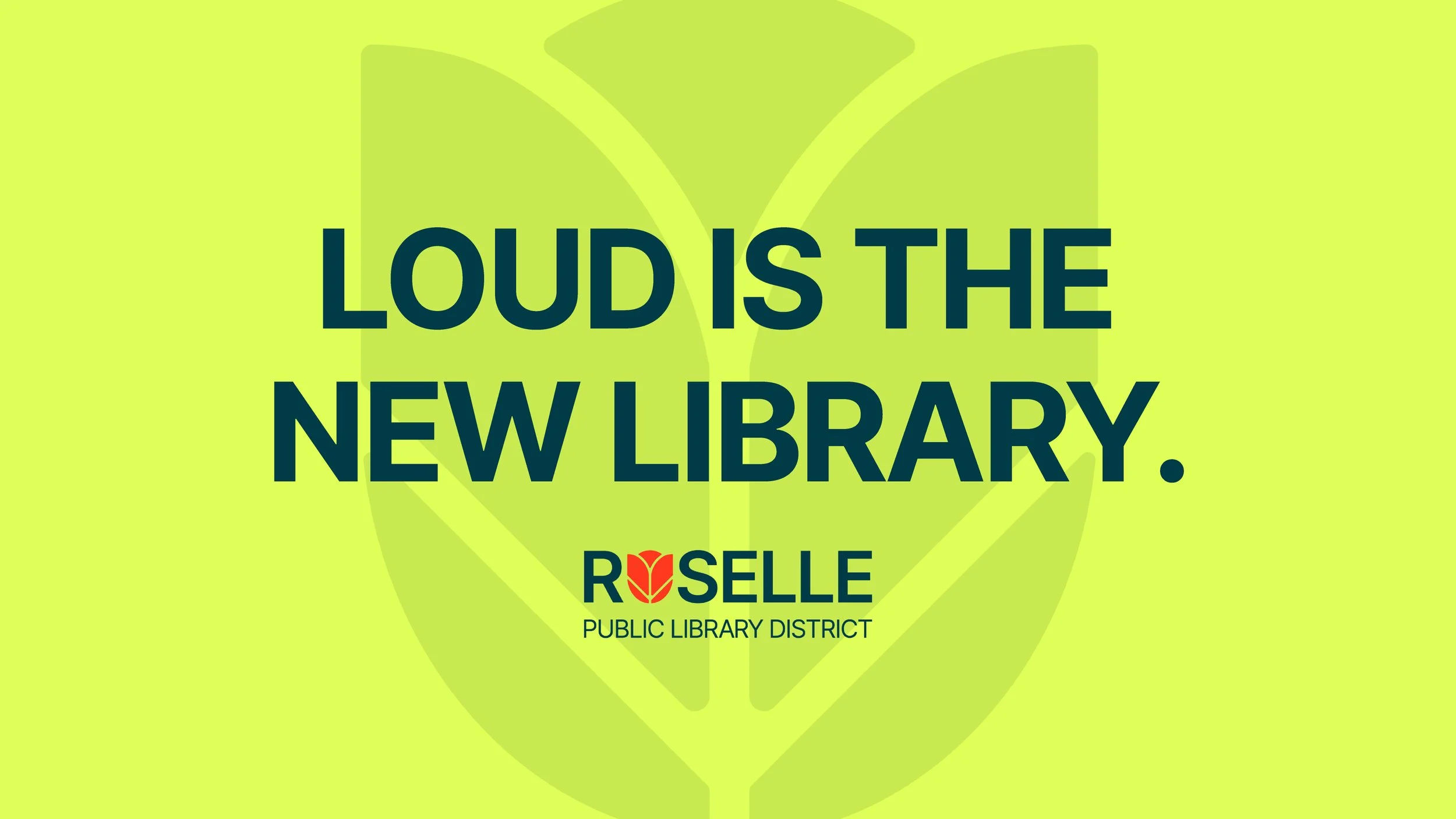
Leveraging existing elements from their current brand, we built a system that retains the core essence of the library with a fresh twist. Starting with the logo, we evolved the rose symbol by simplifying the shapes. The book within the symbol takes center stage while maintaining the integrity of the rose. Inter Tight serves as the main typeface. A typeface that is both modern and accessible with a range of weights. The new brand look is overall vibrant and bold. Opening up room for expressiveness and color that represents the uniqueness of Roselle’s community.